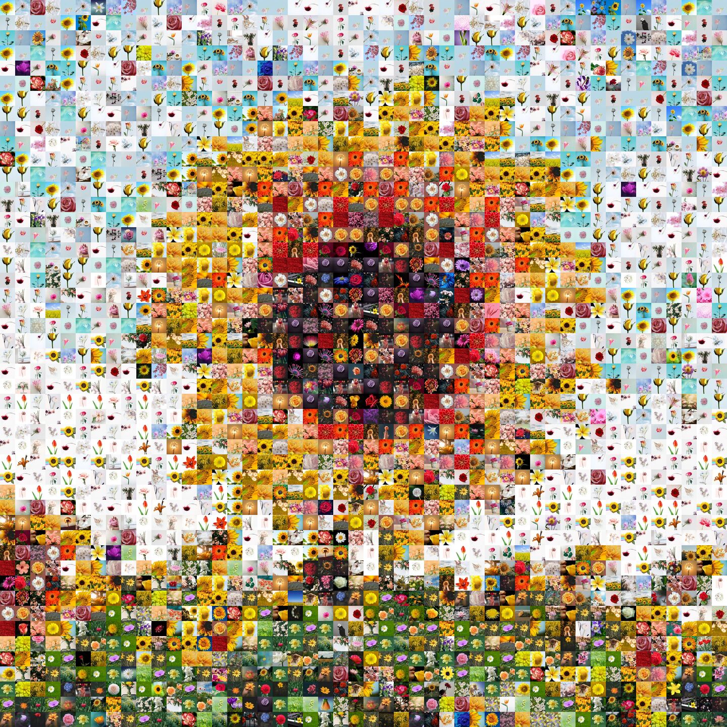


Try moving the colorization slider
The Colorization is how much the big picture is superimposed on top of the small pictures.
Higher colorization will let you see the big picture more clearly, but the small pictures will look more faded.
Lower colorization will make the small pictures more vivid and clear, but it will be more difficult to see the big picture.
There is no "correct" or "best" colorization value. It is ultimately a matter of personal preference. Some folks like to not colorize their mosaic at all, and don't mind if they have to use a little imagination to see the big picture. They like to see the small pictures as clearly as possible. While some people colorize their mosaic so much that you might wonder why they bother making a mosaic at all? If you're going to colorize it to 90%, you might be better off just printing the big picture by itself. But for most people, and for mossaics, the sweet spot is somewhere between 30% and 60%.
While it's true that it is ultimately a personal preference, if you're a first-timer, you may not actually know what you prefer, or what you think you prefer initially is not what you actually prefer in the end, because you haven't had a mosaic that is personal to you hang on your your wall for a long period time. There are things you realize about mosaics only after you've had it hang on your wall for a few months. Most important of these realizations is that being able to clearly see the small pictures is just as important, if not more important than being able to clearly see the big picture. The thing is, people don't look at the mosaic because they want to see the big picture. They look at the mosaic because they want to see small pictures, because those are the stories, and the memories. After a while, you realize the big picture is often just a really cool bonus, or a theme that ties it all together that invites people to come look at all the small pictures.
But first-timers think being able to see the big picture is the most important thing. So they end up colorizing it too much, without realizing how much they're sacrificing the small pictures. The colorization follows the law of diminishing returns. A 40% colorization mosaic, and 60% colorization mosaic may look very similar when you look at it from far away, but the small pictures of a 40% colorization mosaic will look so much more pleasing than the small pictures of the 60% colorization mosaic.
In this guide, we'll go over some common pitfalls, and how to go about striking your happy balance, and some advanced techniques that will further elevate your mosaic, or let you do even more interesting things.
One of the most common pitfalls is increasing the colorization of the whole mosaic, when it is just the faces or text on the big picture that you want to see more clearly. For example, this mosaic was colorized to 60% so that the faces in the big picture are clearly visible. But a better way is to set the mosaic colorization to 40%, and set the tile colorization to the tiles over the the faces to 75%. This results in a mosaic where the small pictures in areas besides the faces are much more clear and vivid, while you can see the faces of the big picture equally clear. Try moving the sliders in the example below to see the difference.


When you compare the overall look of the 40% colorization mosaic vs 60% colorization mosaic, they both allow you to see the big picture. The faces have been colorized separately to 75% on the 40% mosaic, so the faces on these two mosaics look the same. But when you compare the close-up of the small pictures, the 40% mosaic's small pictures are much more pleasing to look at, because it's much closer to to the original color. On the other hand, the 60% mosaic's small pictures look dull and muddy. You might be surprised by how much this 20% difference makes, but if you actually do the math, a jump from 40% to 60% is actually a relative increase of 50%. That means the small pictures lose their colors by 50% when you go from 40% to 60, but you don't gain that much in terms of how well you can see the big picture. But you lose so much in terms of how well you can see the small pictures. This is why it's important to set the mosaic colorization as low as possible, and and colorize just the faces/text separately.

As you saw in the previous example, colorizing more after a certain point only lets you see the big picture a little bit more, while fading the small pictures by a lot. Why is that? Well the small pictures are already arranged in a way such that even if you have 0% colorization, you can see the big picture if you have a good set of photos. So at 0% colorization, your ability to see the big picture is not 0. So the starting point of how well you see the big picture is higher. The better you can see the big picture without any colorization, the less you have to gain by colorizing more.
For example in the above graph, let's suppose you can see about 20% of the big picture just through the arrangement of the photos alone, when the colorization is at 0%. And then as you increase the colorization, you can see the big picture better and better. And for small pictures, you can see it best at 100% when the colorization is 0%, and you can't see it at all at 0% when the colorization is 100%. The rate of decline at which how well you can see the small pictures is steeper and always constant. However, the rate at which you can see the big picture better as you increase the colorization is lower because it's starting at 20%.
So, you're trying to balance how well you can see the big picture, and how well you can see the small pictures. This is ultimately a matter of preference, but there is a sweet spot where you can maximize your return on colorization. Mosaically automatically calculates this and sets the initial colorization for you. You should not deviate from this too drastically. However, many people simply set the colorization to 60%, 70%, 80% without understanding what that does to the small pictures. And they wonder why the small pictures look so faded. But it's also entirely possible for someone to understand all of these things, and still make an informed decision set it to 60% or 70% because it's what they like.

Check out this mosaic that has no background. You can do this by setting the colorization to 100% on the mosaic, and then setting the colorization of the tiles that make up the heart to 0%.
Some people want to write something on the mosaic. There are many ways to do it, like putting it on the big picture, then colorizing the text to make it clear, or writing something on a piece of a paper, taking a picture of it, and using it as one of the small pictures, but you can also use colorization to leave some whitespace in the mosaic. Set a region of the mosaic to 100% colorization, maybe about the size of a postcard, and then can use that space to something with a permanent marker after it's printed.
Let us know if you have something in mind, and wondering if it's possible. There is likely a way, but it actually may not turn out as well as you imagine. For example, we get some people trying to only have photos in the background of a logo. When you imagine it, it seems like a good idea, but when you try it, you find that edges of the logo look weird like this. In any case, we've been doing this a long time, and have seen a thing or two, and we're here to assist you, so just ask us by clicking Chat Now at the bottom right corner of our site, and let's have a chat.